Painted Crossing or Raised Table: Two Ways to Mark a Crossing
Painted crossing or raised table: learn what each makes visible, how drivers and pedestrians read the street, and which conditions suit each approach.
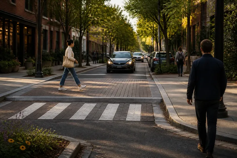
The common mistake is to treat a painted crossing and a raised table as two versions of the same sign. They do different work. A painted crossing makes a path visible on the road; a raised table changes the shape of the road itself. Confusing the two can leave a crossing that looks clear on a plan but still feels difficult to read from the sidewalk.
For a painted crossing or raised table, the useful question is not which one is universally better. It is what needs to become noticeable at this particular point: the pedestrian’s route, the place where a driver should yield, or the fact that the street has entered a different kind of space. The answer depends on how people approach and use the crossing, not just on the paint pattern.
What does paint make noticeable?
Paint gives a crossing a strong visual outline. Broad white bars, parallel lines, or another locally recognized marking can show where pedestrians are expected to cross. It makes the crossing legible from a distance and gives people on foot a visible route across the carriageway. It can also make a driver’s decision point easier to identify, particularly where the surrounding street is visually busy.
That visual cue is useful because roads contain competing information: moving vehicles, parked cars, signs, shadows, storefronts, and the next turn. Markings can pick out one strip of pavement among all of it. They are rather like a highlighted sentence on a crowded page. The highlighting draws the eye; it does not change the page beneath it.
That distinction matters. Paint does not lift the crossing closer to sidewalk level, narrow the road, or physically alter how a vehicle meets the pedestrian route. Its effect depends on people seeing and interpreting it, and on the surrounding design supporting that interpretation. If a parked vehicle or a queue hides the approach, the marking may be visible only once someone is already close to the crossing.
Painted crossings can suit places where the curb geometry already gives people a clear route and the main need is to identify that route on the road. They may also fit a street where the crossing must remain at carriageway level because of drainage, access, transit, or other constraints. Those are not automatic reasons to choose paint; they are conditions to consider alongside the way traffic and pedestrians actually move.
What changes when the crossing is raised?
A raised table carries the pedestrian route across a platform at a higher level than the adjoining roadway. Instead of relying only on a pattern, it creates a visible and physical change in the street. Drivers encounter a different road profile at the crossing, while pedestrians see a continuous plane that connects the approaches on either side.
The raised surface can make the crossing feel like a place rather than a marking laid over a vehicle route. It can also clarify where the pedestrian path runs, especially where the sidewalk and crossing are designed to meet cleanly. The shift in surface and elevation gives the eye another cue, even when paint is worn, dim, or partly obscured.
But a raised table is not simply paint with more ambition. Its design involves the curb transition, drainage, surface materials, and the needs of people using mobility devices, pushing strollers, or moving goods. A poorly resolved edge can make a supposedly continuous route awkward to use. A surface change can also be less legible than intended if its color and material blend into the surrounding roadway.
Raised crossings therefore suit locations where a stronger spatial cue is useful and the street can accommodate the physical form. They can be considered where the crossing sits within a pedestrian-oriented place, such as a neighborhood street or a route between active destinations. Whether that form fits depends on the street’s layout and operating needs, not on a general preference for raised surfaces.
How do the two options affect what people read?
Paint and elevation speak to different senses and from different distances. A driver approaching a painted crossing may first notice its pattern. At a raised table, the platform and its edges can signal a change in the road profile as well as a crossing location. A pedestrian approaching either one needs a route that is easy to locate from the sidewalk and clear on the far side.
These cues are not substitutes for one another in every respect. Paint can make the crossing’s footprint explicit without changing the road’s shape. A raised table can make the crossing’s position and level more apparent, but its layout still needs to communicate where pedestrians should travel. A raised surface without clear boundaries may create a broad platform that is less obvious than its designer intended.
Visibility is also a matter of approach. On a straight, open street, a painted pattern may be easy to pick out well ahead of the crossing. Near a bend, a crest, a row of parked vehicles, or a cluttered junction, the same marking may appear late in a driver’s view. A raised table can add a change in form, but it cannot make an obstructed approach visible by itself. Sightlines and the placement of the crossing still matter.
Think about the crossing from each direction rather than judging it from one plan view. A person walking toward it sees the sidewalk edge, the waiting area, and the route across. A driver sees the road in sequence: approach, crossing, and departure. If those readings do not line up, a crisp marking or an elegant platform may still leave people unsure about where to look or yield.
Which approach suits which street?
A painted crossing may be a better fit when the street already provides a straightforward pedestrian route and a clear visual cue is the main missing piece. It can suit a crossing where the roadway’s profile should remain unchanged, or where the surrounding design already signals the pedestrian space. It is less suited to a location where the crossing is hard to notice despite visible markings, because the underlying issue may be the approach, visibility, or street geometry.
A raised table may fit when the crossing should read as a distinct part of the street’s public space, and when a continuous raised route can be integrated with the adjoining sidewalks. It is especially relevant to consider where pedestrians need the crossing to stand out as a physical place rather than merely a painted zone. Its suitability still depends on how the street serves vehicles, transit, deliveries, drainage, and accessible movement.
Neither option should be selected by appearance alone. A vivid paint scheme can look decisive in a drawing while remaining easy to miss from a driver’s approach. A raised platform can look prominent from above yet create confusing transitions at its edges. The useful comparison is between the cues each option supplies and the cues the location lacks.
Say a neighborhood street has a clearly aligned sidewalk route and an open approach, but people crossing are hard to pick out against the dark pavement. A painted crossing could make their route more noticeable; the expected observable result would be a clearer visual boundary at the point where people cross. Imagine instead that the route passes between two active corners, but the roadway surface makes the crossing feel like an interruption in the pedestrian path. A raised table could create a more continuous plane; the expected observable result would be a crossing that reads as a distinct, level connection between the sidewalks. These are different starting points, so the same treatment need not suit both.
What should you ask before choosing?
Does the crossing need a visible route or a changed street profile?
If people can already follow a clear path and drivers mainly need to see its location, paint may address the specific gap. If the street needs a stronger spatial cue, a raised table may be more relevant to consider.
Can people see the crossing as they approach?
Look from the driver’s approach and from each sidewalk, including the view past parked vehicles and street corners. If the crossing is hidden by the layout, adding a surface treatment alone may not resolve the basic visibility problem.
Will the pedestrian route remain clear at the edges?
Check how the sidewalk meets the crossing and how the far-side route continues. A raised table needs transitions that make sense to people walking, using wheelchairs, or pushing a stroller; painted markings need a clear connection to the place where people wait.
What else must the street accommodate?
Consider drainage, transit, loading, turning movements, and access to nearby properties before treating either form as a simple surface choice. The local design standard, product instructions, and applicable rules can determine which details are acceptable.
How can the choice stay specific?
Start with the thing a person should notice, then identify what currently prevents that. If the missing cue is a marked crossing line, paint may be the more direct response. If the issue is that the crossing does not read as part of the pedestrian realm, a raised table may deserve consideration. If neither description matches the problem, the answer may lie in the approach or the sidewalk connection rather than in choosing between these two treatments.
Keep the comparison grounded in what a person can see and follow: the location of the crossing, the route from curb to curb, and the way the street presents itself on approach. A painted crossing or raised table is useful only insofar as its cue fits the place. The best choice is the one that makes the intended crossing legible without asking the surface treatment to solve problems it cannot change.